Since we know a lot of creative and skillful artists from all over the spectrum of genres and techniques, we taught it would be more interesting to present the opinion of another artist – in this case, type designer. Please find below the commentary on Inari Type font by Paris-based designer Morgane Vantorre (with whom we made an interview earlier).
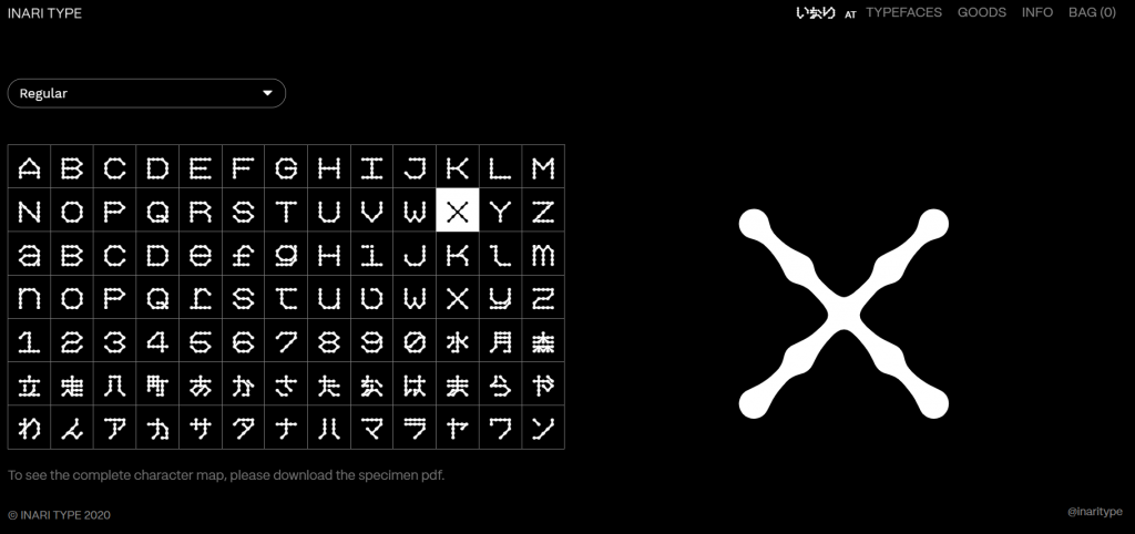
Inari Type [Inari in Shinto mythology from Japanese – „The god of harvests, fertility, rice, agriculture, foxes, industry, and worldly success“] is an independent type foundry based in Campinas, Brazil. Founded just this year 2020 by Caio Kondo and Satsuki Arakaki. I’ve found them just as in many cases through Instagram scrolling and I was amazed immediately. Totally unique letters, like from some artificial invented language. I’ve asked right away Morgane if she would be interested in writing a short comment about the original typeface, and she happily agreed. Check out below the examples of Inari Type and read Morgane’s review.
„Our services consist on typography distribution, tailored to the needs of your organization, no matter its size. Whether you need a (1) bespoke typeface, (2) translation to another writing system, (3) character set expansion or (4) specific adaptations in one of our typefaces.“ – Inari Type
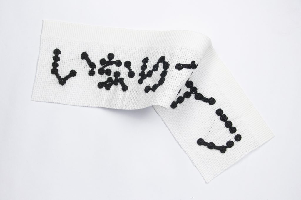
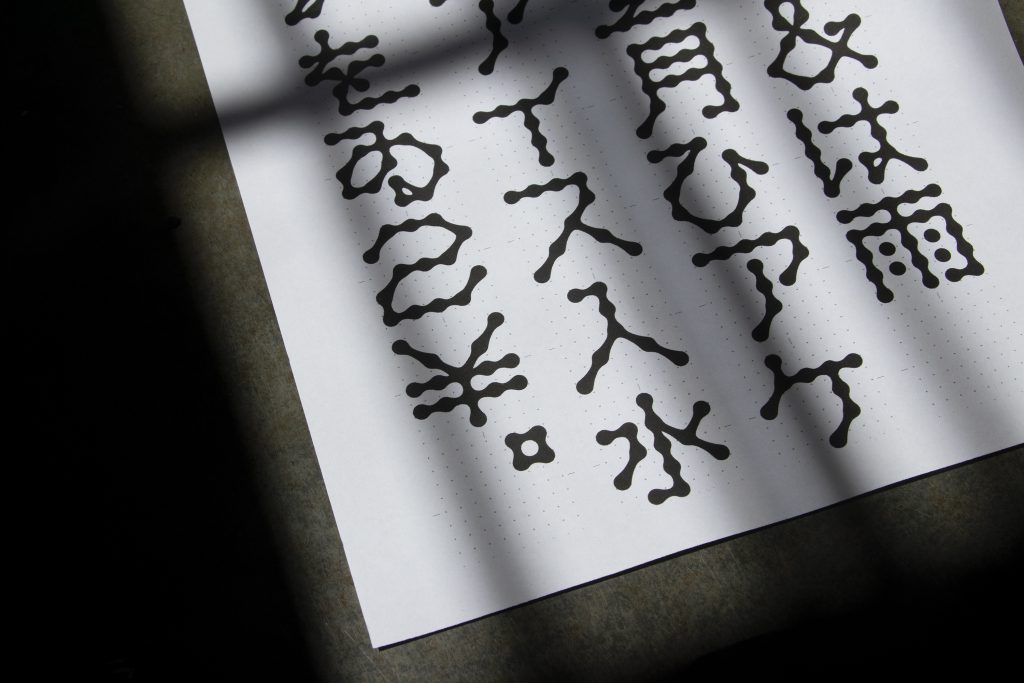
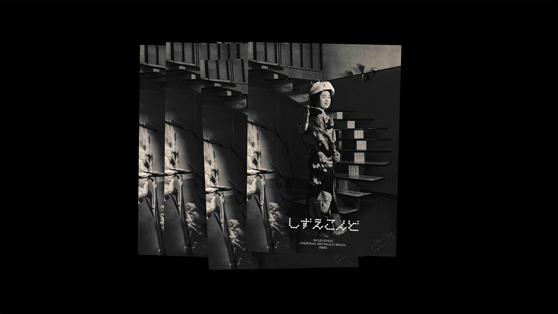
Designer Morgane Vantorre on Inari Type: „I discovered Inari Type through this typeface which immediately paid my attention. At first sight, its shapes seem to us so unlikely. Lines, far from straight or organic lines we usually meet, look like cute chains that manage themselves to form both Latin, Japanese alphabets (Hiragana and Katakana) as well as Kanji letters, following a monospaced style. This bias gives to the typeface a strong personality, tinged with a kind of poetry, where form gets a special value which supplants a moment the first communicative function of writing. Thus, we are more tempted to contemplate the words than read them, even if the legibility of each character is meticulously thought. Moreover, the particularity of „Inari display“ comes obviously from the origin of the shape concept the team has chosen: leaning of Japanese culture, the modular system is based on manual art such as tricot or embroidery which enables them to rethink the manner to build a letter through matter and technical constraints. (Btw, I invite you to discover the work of @mary.type who have followed on from the process by interpreting the typeface by means of embroidery language.)“
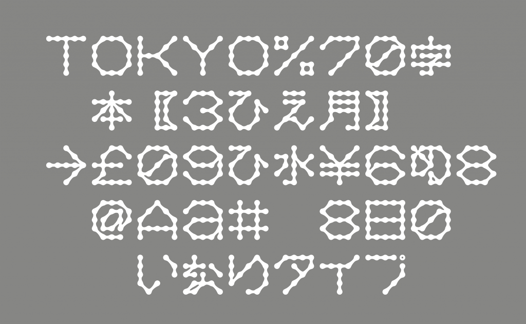
„By examinating other art resources, it generates an inspiring link between Japenese tradition and contemporary typefaces, between Asian and occidental cultures. Rich melting-pot which occasion a nice work and push a little more Typography boundaries. In addition, to be very kind people, Inari Type appears to me as a promising type foundry, I am eager to discover more from them!“
◜
Follow ► Morgane Vantorre + Inari Type on Instagram ●
◟
Idea: Krištof Budke / Commentary by: Morgane Vantorre
Pridaj komentár