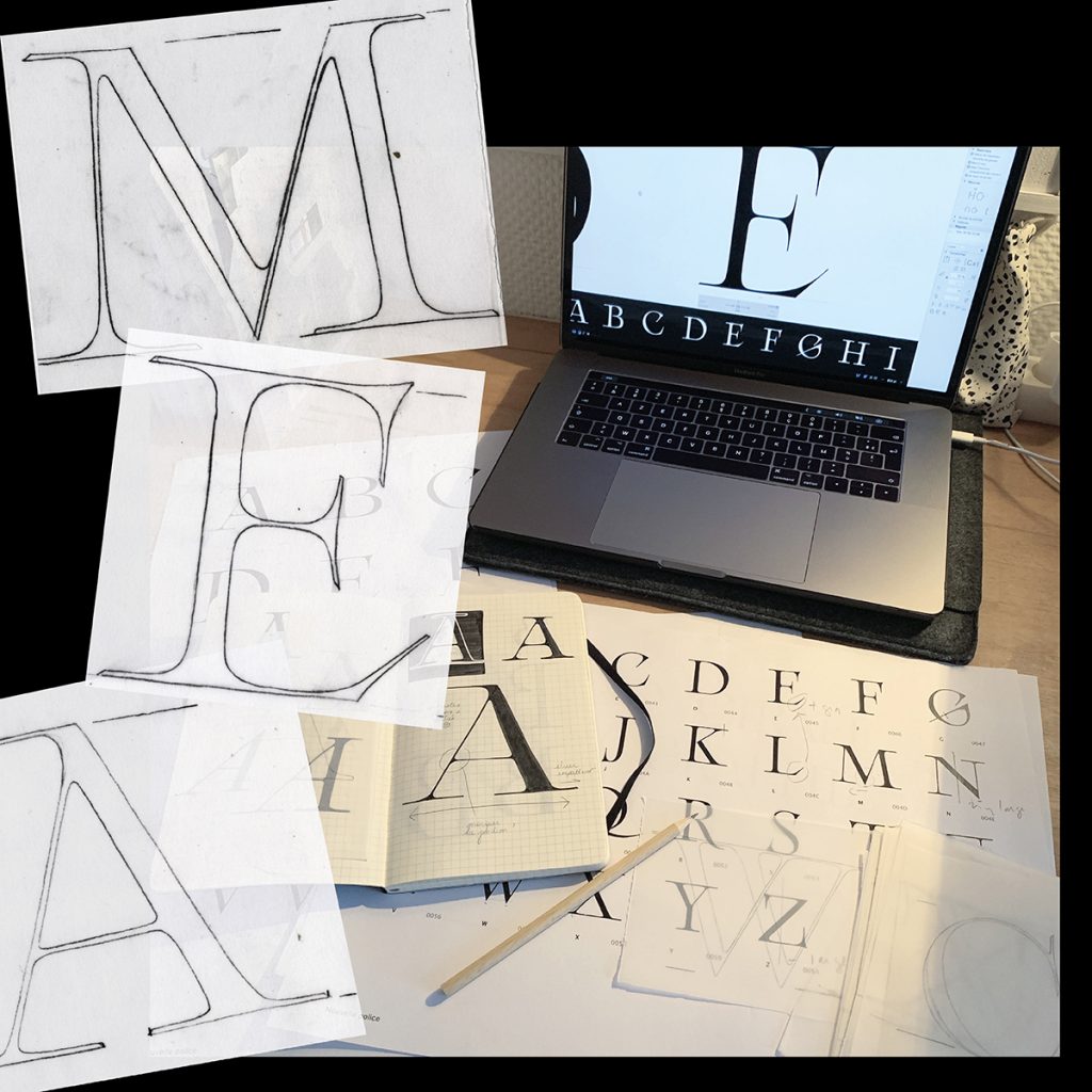
Morgane Vantorre je francúzska dizajnérka, ktorá sa primárne venuje typografii, grafickému dizajnu a web dizajnu. Je študentkou magisterského programu typografie a dizajnu písma na parížskej univerzite École Estienne. Ako uvádza na svojej webstránke (na ktorej sa dá kresliť!), rada taktiež kreslí a fotí. Morgane som našiel na Instagrame v záplave príspevkov dizajnérov, ktoré mi hádže algoritmus sociálnej siete. Prvý stret s jej prácou bol cez jej príspevok nádherných ligatúr z jej nového fontu Arthémys.
[UPDATE]: Listen to a special music mix of fine French pop – selected by Morgane!
Prečítajte si už náš e-mailový rozhovor s francúzskou dizajnérkou, ktorá nám detailne popisuje svoje projekty a celkový kreatívny proces.

I really loved your project celebrating the 100th anniversary of Bauhaus. Can you tell us more about the creative process of this task? How do you start working on this?
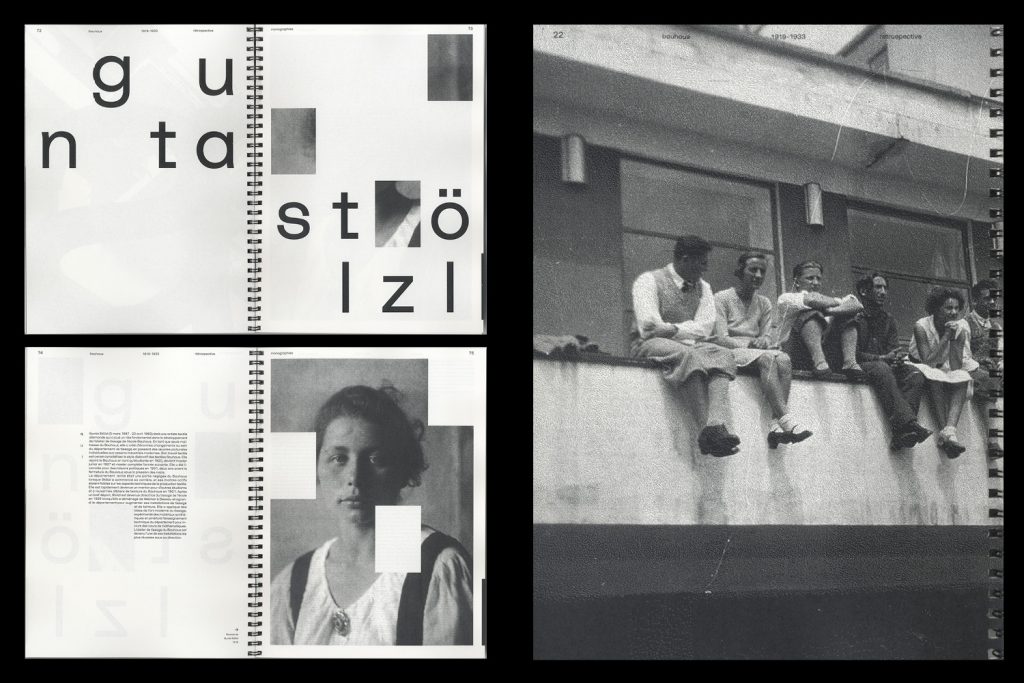
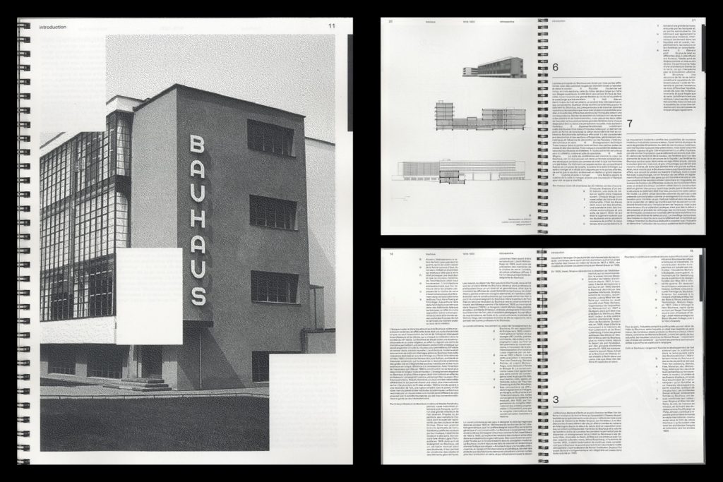
On the occasion of 100 years anniversary of Bauhaus, I have made an active review that contains three monographs of Gunta Stölzl, Mies Van der Rohe and Marcel Breuer. My editorial concept is based on a constraining and systematic grid (inspired by Bauhaus architecture) which influences text layout.
Timelapse video of the content here below:
Each element (text or image) follows the particularities I have imposed myself, which produces curiosities. I really liked working on it and playing with the grid system to enables unusual layout. I also focused on the sheet’s matter in order to create transparency games between the letters and the images (in fact, I really like to play with the subtility of the materiality: it makes the difference on a project). This project was a school project but we were totally free of the content and the form: a great way to experiment!
During your studies, you’ve been to a couple of internships and residencies. How useful it was for you and what have you learned specifically?
Indeed, I made an internship for three months (at the beginning of 2018) at Michel Bouvet’s Studio in Paris. I think it was one of my better experiences since I have started my studies. Indeed, more than just getting a professional overview (I learned a lot due to regular software practices or client exchanges), I also met incredible people with who I still have relations today.
Especially, I have kept a close relation with Michel Bouvet who shares the same ideas as me. Together, we exchange a lot about Graphic Design on its present status and its posterity. We are convinced by the power of that discipline in our society, by the effects it produces which contributes to a structuring of the unconscious. Our intellectual discussions motivate me a lot and enable me to always going far in my thoughts. We have in mind several projects together for the future.
What about your studies at École Estienne in Paris? Are you happy with the university and in collective of your class/atelier – is it beneficial for you?
I have just started in September an MA specialized in Type design at École Estienne. But it is not my first year in that school. I did, before, a two years degree specialized in Graphic Design. So Estienne is becoming a second home for me aha. In fact, I may assert I have never felt so fulfilled within my studies: this school is incredible. First, the atmosphere is very convivial and welcoming. Moreover, the location and the architecture of the school are a real pleasure for the eyes.
Then, I am a member of a class of only 12 type designers in-the-making. So we are very close together but also very close to our teachers who consider us as professionals more than «just» students. Thus, it is very nice to work with them since they never brake our creativity. They rather push us to follow our own way, to question ourselves and they help us a lot to develop our own conceptual positions in regard to our discipline.

Stone carving workshop at Vilnius School of Arts Lithuania.
By the way, we have a multidisciplinary practice approach of typography: we create typefaces obviously but we have also a huge focus on edition, graphic design, calligraphy, web design, and even stone carving. Moreover, what I really appreciate is that we also give great importance to reading and writing activity. Indeed, I am persuasive that, in our career dominated by visible practices, getting an intellectual step back is important. I think it is necessary to have both a practical and reflexive approach in order to not become servile by our work or by a third party. In other words, I can say I really like my studies. It appears to me as a real source of motivation due to creative stimulates and social meetings.
Nevertheless, I am a person who is very efficient by herself. I mean, concerning my work condition, I need to have a time of introspection, to be in my own bubble, with music to stimulate my brain, far from the school. When I am at home, I feel so productive. I always organize my days. I think of time by sequences. I have a diary where I am used to noting all I have to do during the day. Thus, I always know what I have to do and it helps me to be more efficient. I get that from my mother who is a very methodical person.
• My perfect daily routine could be like this:
I start my day with a sport session and a tasty breakfast. I take a time to keep me inform of actuality and answer to messages, then I spend my time to «work» and when I am „on the roll“ I can’t stop myself. I can’t count hours I spend on a project because I don’t see it as work but as a hobby.
A) In your next project, „Alphabet Arithmos“, you’ve asked – Can the same sign have a plural meaning? Do you study semiotics and it is one of your inspirations for your art?
Of course, as a type designer, I have to be aware of signs’ science. It is something that fascinates me a lot. I am always questioning myself how a simple sign, a simple abstract form, can transfer such immense meanings? Anne-Marie Christin, Jacques Derrida, Tim Ingold, Roland Barthes, to quote only the best knowns examples, inspired me a lot. In that project (which begins to be old aha), I wondered if a sign can have plural meanings?
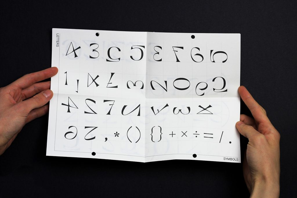
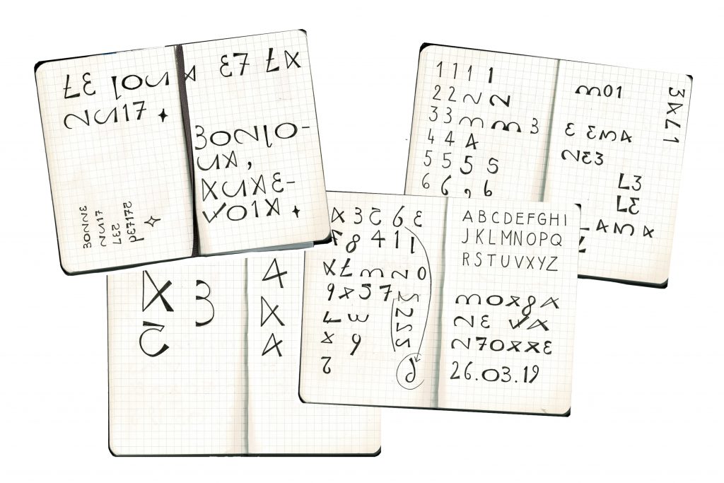
This experimental project presents the beginning of a reflection on the signifying envelope of the letter, with reference to the principle of multistability (part of Gersalt’s law), which underlines the specific ability of the eye to identify a form of different ways. What about a number that becomes a letter? From a letter that becomes a number? Can a sign express two signified antagonists? The idea is to explore and re-examine the potentialities of our visual acuity, our ability to recognize and attribute meaning to signs. Animated paper and digital media have been designed for this purpose.

„Bouc(quet) émis(myst)saire(ère) – A poster that displays an essay I wrote about the French expression « bouc émissaire » that I have always confused with its homonym « bouquet mystère ». What interests me is show formal and phonetic similarities of the two expressions and to insist on the confusion which operates between them.“
B) What are some of your inspirations for your art projects? For example, philosophy, semiotics, art history, architecture… in which field other than typography itself, do you find inspirations?
When I start a project, I firstly involve my self inside the subject by defining its concepts. I think a lot through images or shapes associations but also by words. I need to understand the essence of the topic in order to be conscientious. Thus, I give great importance to research state: I read and write a lot (mindmaps, etc). It helps me to clarify my thoughts.
Then, I think through images with sketches, before search visual inspirations through my books, my notes. I always make sure the concept is closest to ideas and content put in the spotlight.
Nevertheless, with hindsight, my work is obviously influenced by all physical/numerical shapes/forms around me. Thus, nature first is a great source of inspiration (fascinated by shadows and light games), but also daily objects, letters in town (Paris is very rich), art exhibitions… I think that every shape is a potential source of inspiration from the moment we look at them with a fresh look. I am used to taking a lot of pictures in order to create my own bank of images to avoid Pinterest or other types of social networks which are bottomless pits…
► I think that every shape is a potential source of inspiration from the moment we look at it with a fresh look •
► I am used to taking a lot of pictures in order to create my own bank of images to avoid Pinterest or other types of social networks which are bottomless pits •


„A graphic adaptation of a novella named La Chevelure (1894) written by Guy de Maupassant. I experimented with the reverse printing of the paper : the reverse text is thus imprisoned by the binding, just like the character «possessed» by the discovery of a lock of hair. A superimposing print is moreover used, accentuating some words in his personal notebook, which enables a dual reading.“
Moreover, I have a special look at the past, what was already done to rethink the future.
I have an interest in old books and old typefaces thanks to the inherence of my grandfather who was a teacher and book lover. He let me all his collection which represents a rich source of inspiration for me. By the way, he also passed on me his taste for reading and his bookshops and libraries madness.
Definitely, I think my body of work is the refection of my personality: perfectionist, organized and hypersensible. I always research the purest shape, the more efficient and minimal way to evoke messages/concepts with certain attention of details. In fact, I always think of an object as a whole (shapes, matters, material conditions…) and try to give sense to each detail. I like to enable people to get several reading levels and maybe surprise them through the littlest element.
Can you tell us some of your favorite designers, artists or collectives? Who do you follow and admire?
It is a difficult choice for me but I could cite contemporary graphic & type designers such as Ines Cox, Karl Nawrot for their minimalist and pure approach or Charlotte Rohde or Virgile Flores for their eccentricity. I also admire many artists such as Paul Klee, Matisse, Ellsworth Kelly and more recently I have discovered the incredible work of Louis Jou who made many typographic artworks with many ligatures.
Thanks a lot for your interest, it makes me very glad! If you are interested, you may follow me on Instagram with @gagane_ where I regularly share what I do, on my website http://morganevantorre.com/ or by mail at morgane.vantorre@hotmail.fr for submissions or collaborations 🙂
–
Interview by Krištof Budke


Pridaj komentár